Mobile & Web App
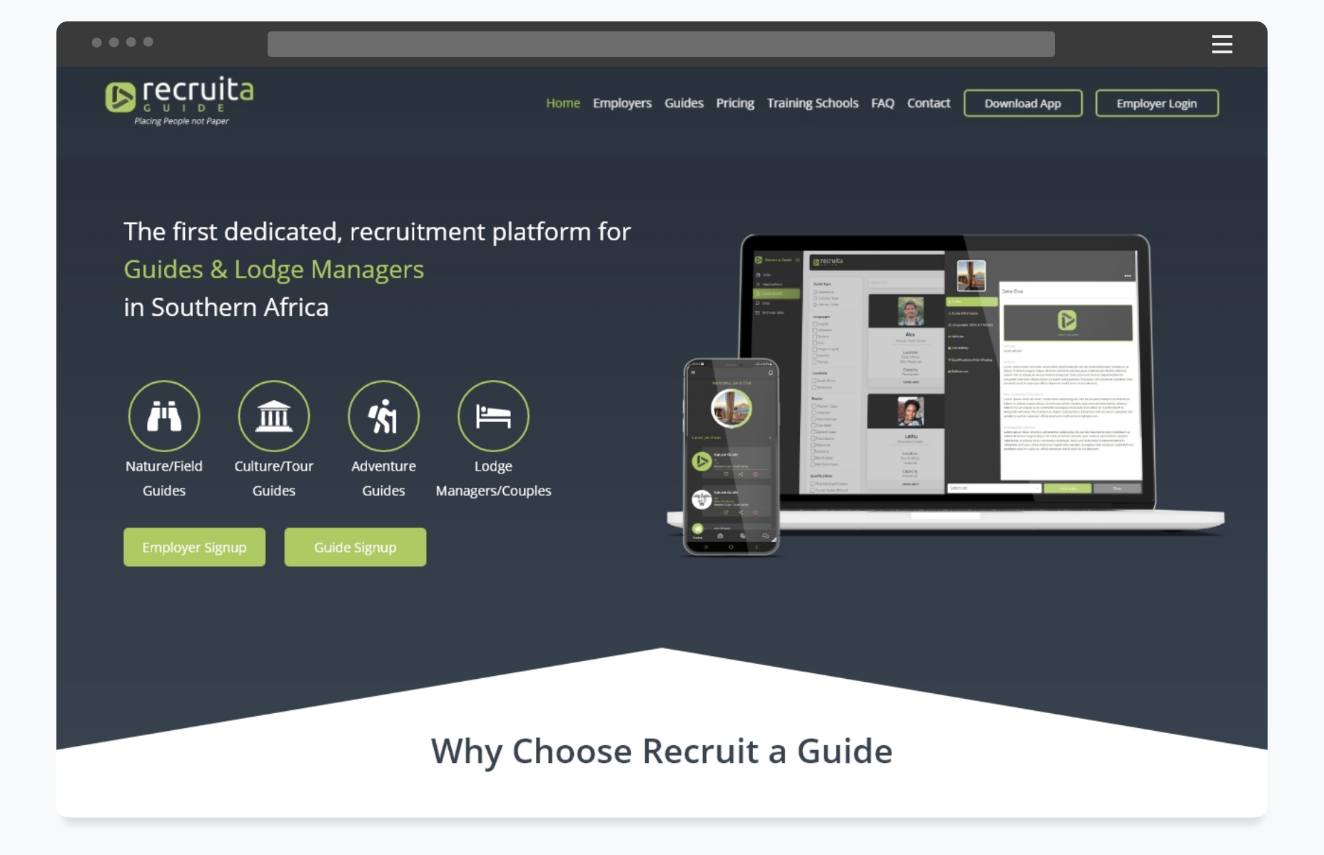
Recruit a Guide
Southern Africa’s first dedicated recruitment platform for Nature Guides and Safari Lodge Managers.
Time frame
Dec 2021 – May 2022
My Role
UX/UI Design
Visual Design
User Research
Competitor Research
Usability Testing
Heuristic Analysis
Tools Used
Adobe XD
Illustrator
Miro
SendGrid SMTP
Smartlook Analytics
Google Analytics
Azure
The Team
1 x UX/UI Designer
1 x Web Developer
1 x Mobile Developer
THE PROBLEM
A large portion of the tourism industry in Southern Africa is propped up by Nature and Adventure tourism. Historically this sector has lagged behind the tech curve, and employers have struggled to connect with qualified guides and lodge managers.
Discover
Recruit a Guide was created in 2019 to meet the growing need for a dedicated recruitment platform for the guiding sector.
Before COVID, the database grew to over 4000 active guides, with up to 50 jobs a month being posted on the platform.
While the product was successfully meeting the needs of the sector and solving its inherent problems, the usability and stability of the platform was poorly executed and unreliable.
My team and I were tasked with redesigning and refactoring the Recruit a Guide web and mobile app.
Explore
I started off by conducting my own usability/performance testing and heuristic evaluation of the product. I ran through dozens of user and task flows while documenting all the obvious issues and bugs.
I then did interviews with existing employers using the platform to discover where they were struggling in the recruitment process and areas they wished were improved.
I also set up Smartlook recordings and started monitoring user behavior on the current mobile app, these recordings helped me discover the bottlenecks and pain points for the users.
DEFINING THE PROBLEM
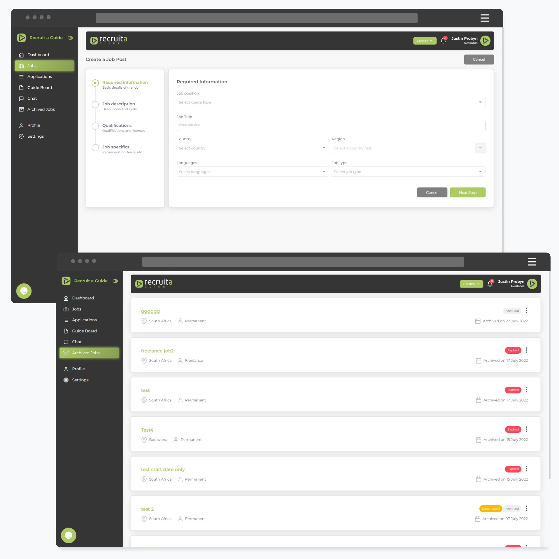
After correlating the findings, I proposed the following areas of improvements on the Web App:
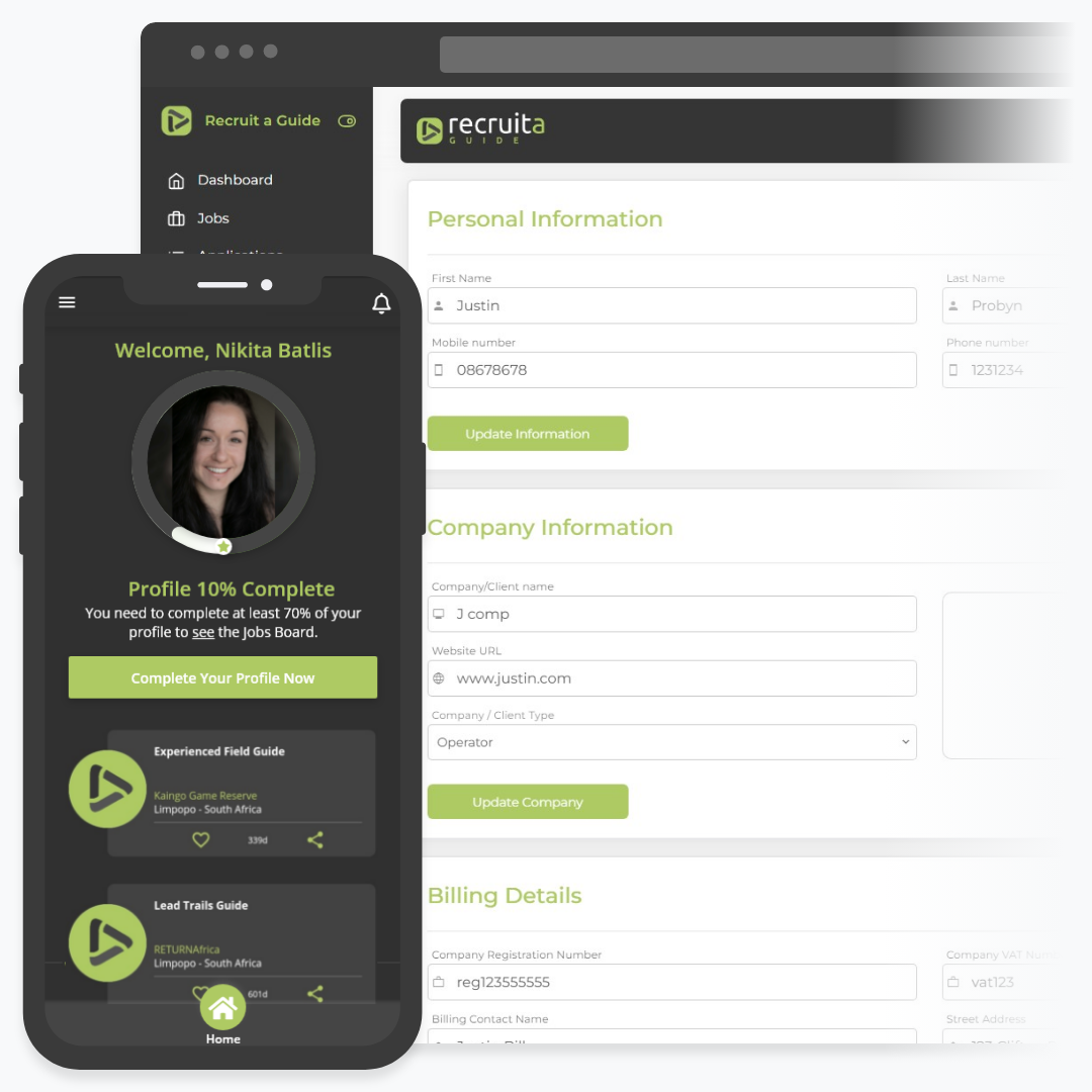
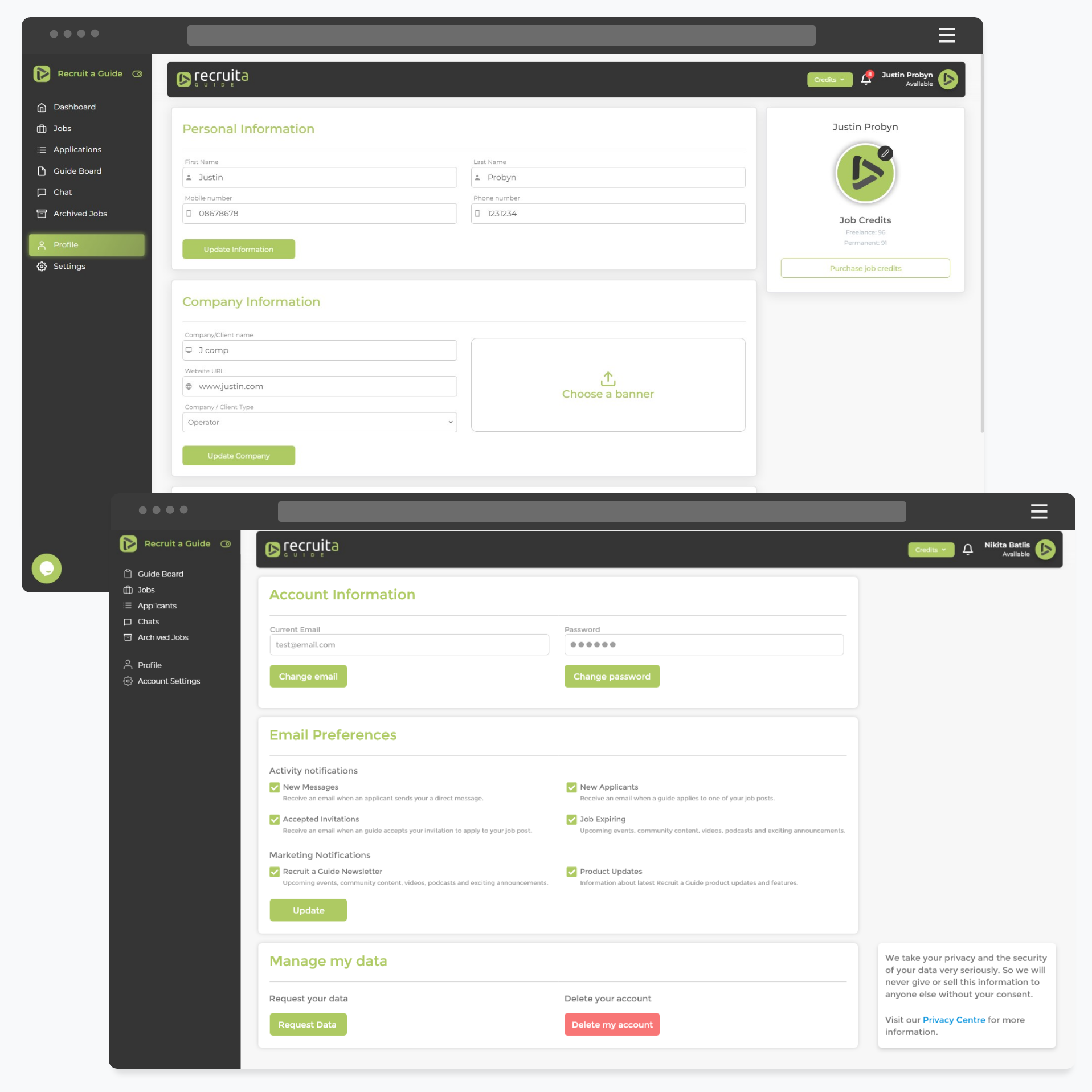
- The Employer onboarding flow
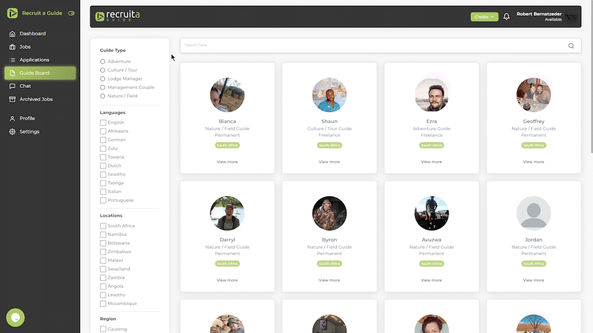
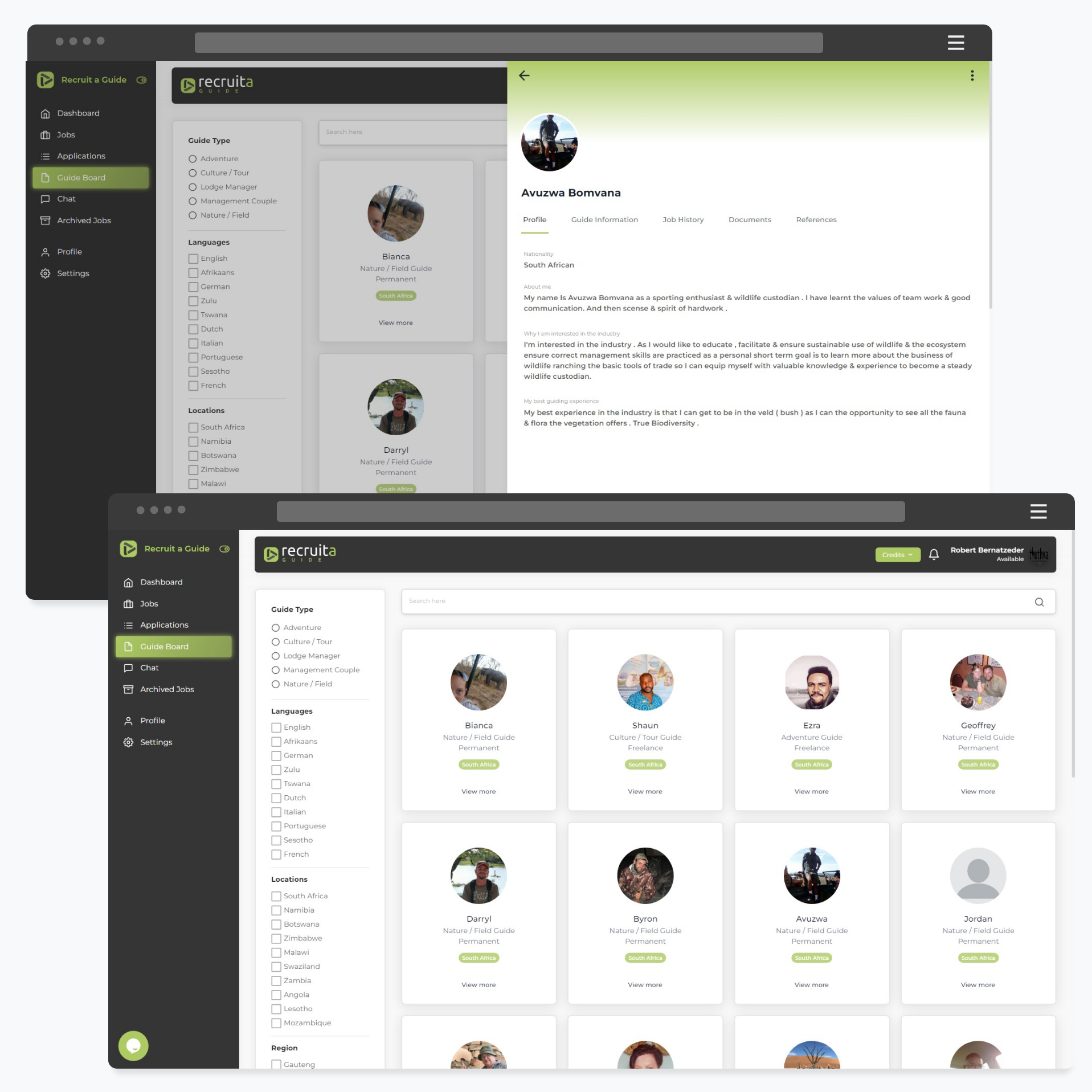
- The candidate profile design and layout of information
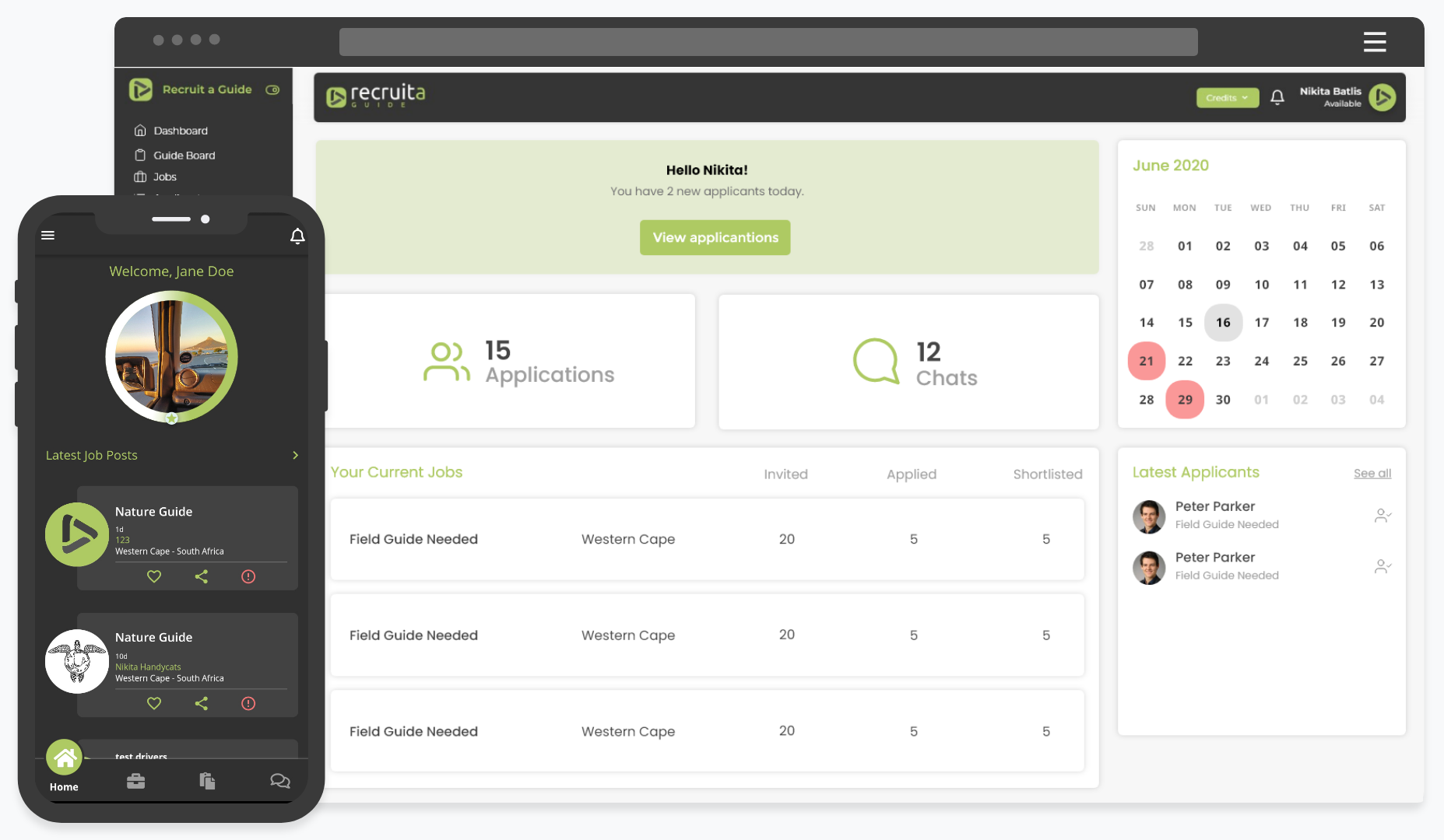
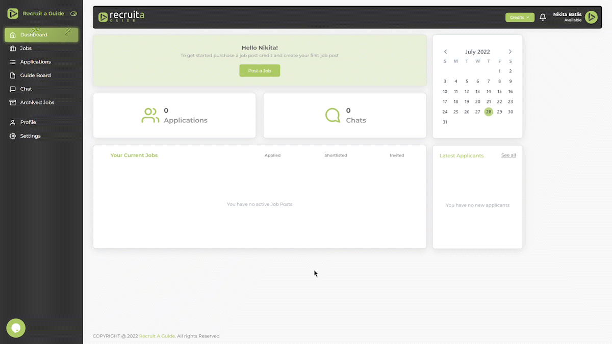
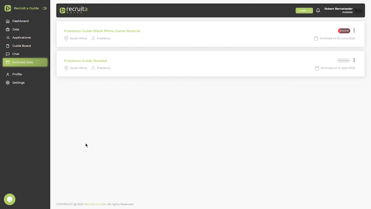
- Adding a dashboard with correlative data and navigation
- Improving the stepper and design of the job creation task flow
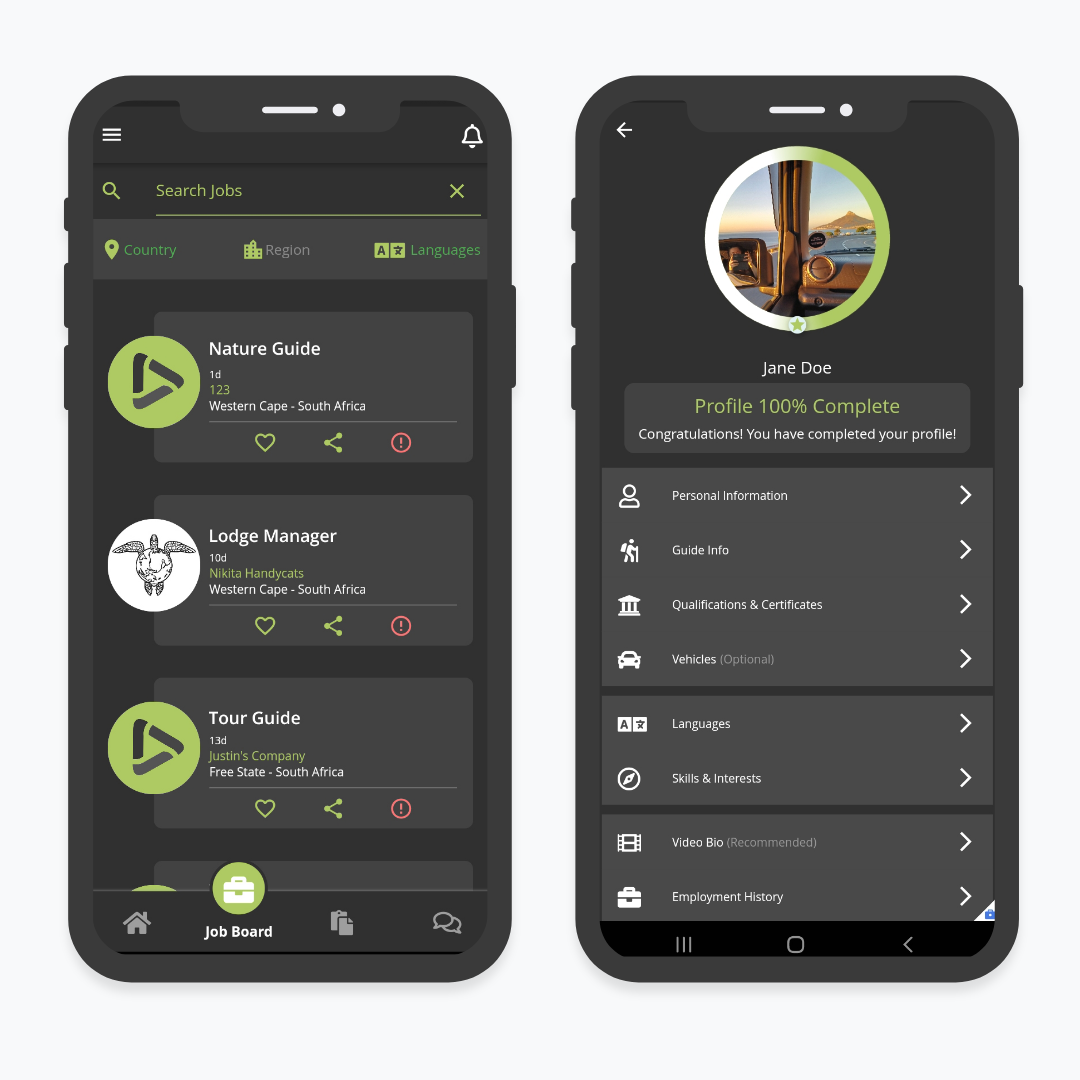
On the mobile app, the following problem areas were discovered:
- The candidates onboarding and profile creation
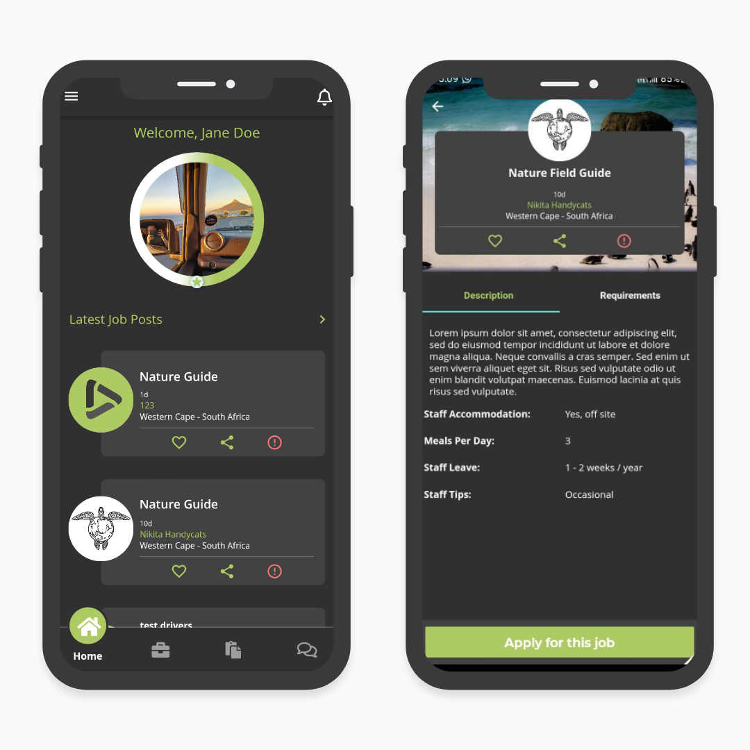
- The landing screen progress bar and navigation
- The design patterns used in the forms
Develop
The product owner requested that the new designs maintain the current branding, and that the overall gird layout of the platforms stay the same. Only the components and forms within the current layout were to be redesigned.
I started off by breaking down the project tasks into the user flows that would be improved upon. I then focused in on specific screens or components that would be worked on.
Since I had existing styles to work with, I jumped straight into medium to high fidelity wireframes of specific screens.
Test
Each new component and screen was presented to the team and product owner for analysis before the developers would start building it in the staging environment.
I worked on the web app and mobile app designs simultaneously and was handing off wireframes to the developers each sprint.
Listen
Each new component design or screen re-design was rigorously tested and iterated on before progressed on the next section or task.
While this incremental approach wasn’t the most time efficient, my team preferred this method of development, as it helped the developers understand the existing code base and its limitations.
Deliver
Overall we progressed through the tasks seamlessly, and by the end of Q1 2022 we had tackled the major problem areas of both platforms and received positive feedback from the product owner and testers.
During the last phase, we designed and implemented the new dashboard for the web app.
I was able to test the usability and monitor performance of this dashboard with live users through our Smartlook recordings.
We began to see an upward trend of new job posts and user retention by the end of June 2022.
The challenges and what I learnt
- You need to entice the user with a carrot, to get them to pull the cart. Showing users a sneak peek of the current job posts or available candidates was better at motivating them to complete their profiles than a carefully thought out profile stepper.
- Tech literacy and language barriers. . No matter how hard you try, there are some obstacles you cannot move for the users.
- Test on smaller, slower devices! Mobile responsiveness and app performance on much smaller screen sizes needs to be tested more rigorously. Screen resolutions will vary greatly in different socioeconomic climates.
- Search for feedback, constantly. Being a solo designer on a multi-platform product is daunting, and there is no possible way you can know and see everything. A fresh set of eyes is always helpful.
Web App built in VueJS 2, TailwindCSS and WordPress marketing pages,
with a NodeJS and Firebase backend.
Mobile App built in Flutter.